Editorial & Print
Food Guide Newsletter
This concept was an opportunity to explore editorial layout through a local food publication. The focus was on creating a reading experience that feels fun, inviting, and easy to navigate while giving each feature its own visual personality.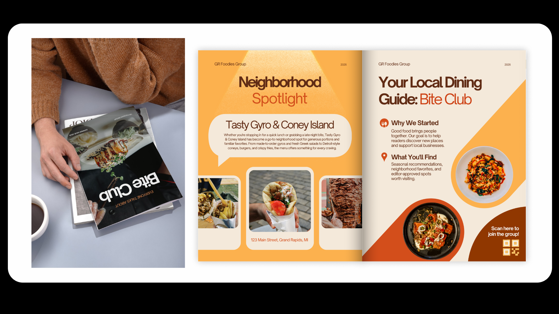
MUSE GR Art Gallery
Print work for a small gallery using bold type and simple layouts. Clean spacing and strong hierarchy keep things easy to read while still feeling sharp and intentional.Nightingale College Print Work
Designing for higher education means balancing information with readability. From newsletters and flyers to large-format print, each piece is built to communicate clearly while staying visually engaging through thoughtful hierarchy, iconography, and clean layouts.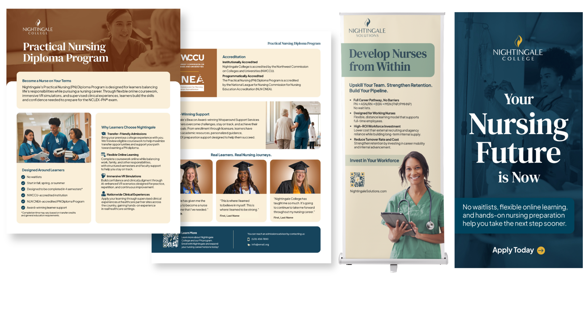
Solawave - Catalog & Magazine Work
Editorial layouts, promotional print, and retail graphics created for the beauty industry. The work focuses on clean composition, strong typography, and eye-catching visuals that stand out while reflecting a modern skincare brand.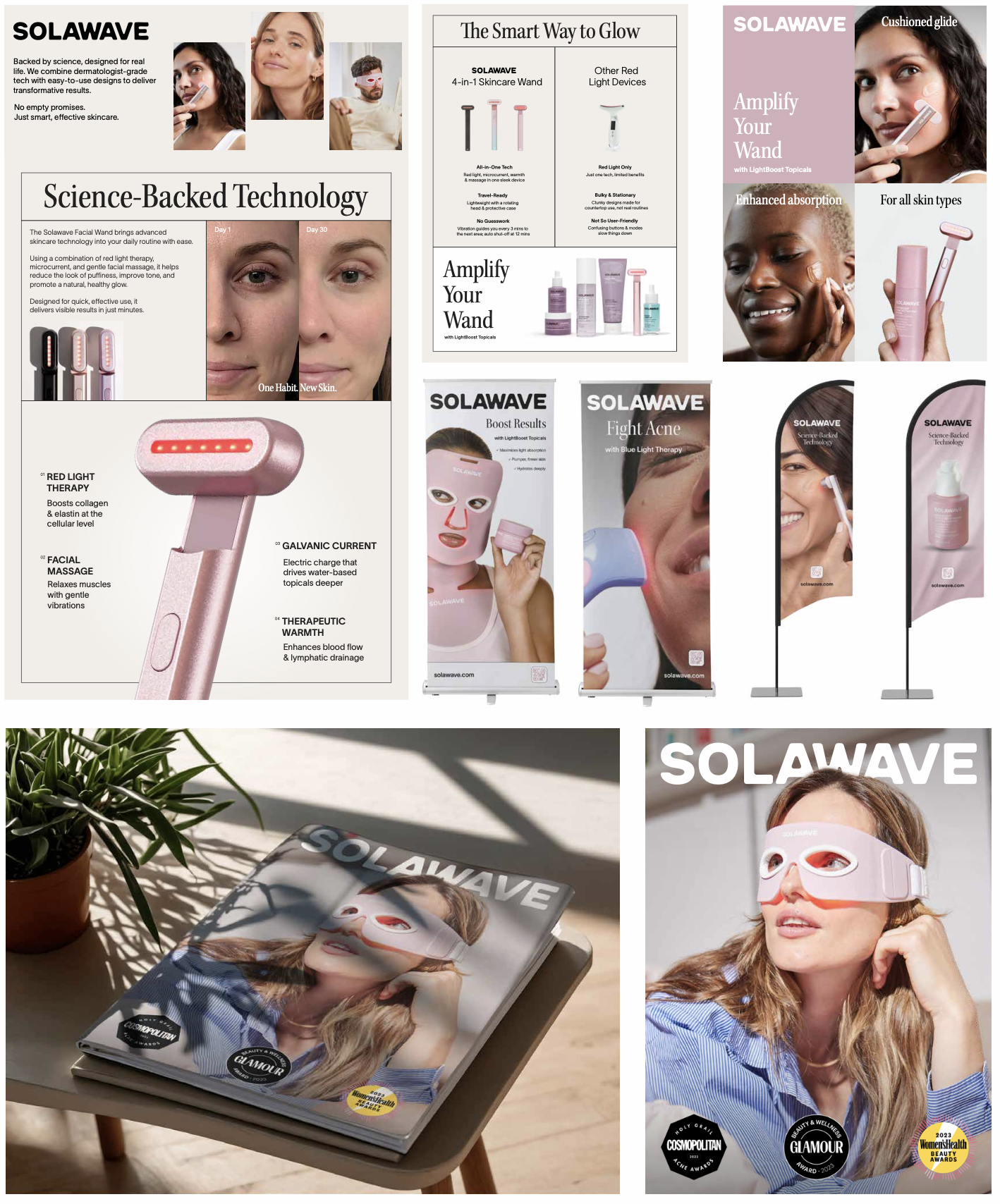
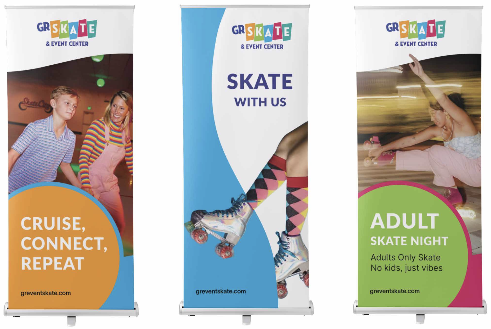
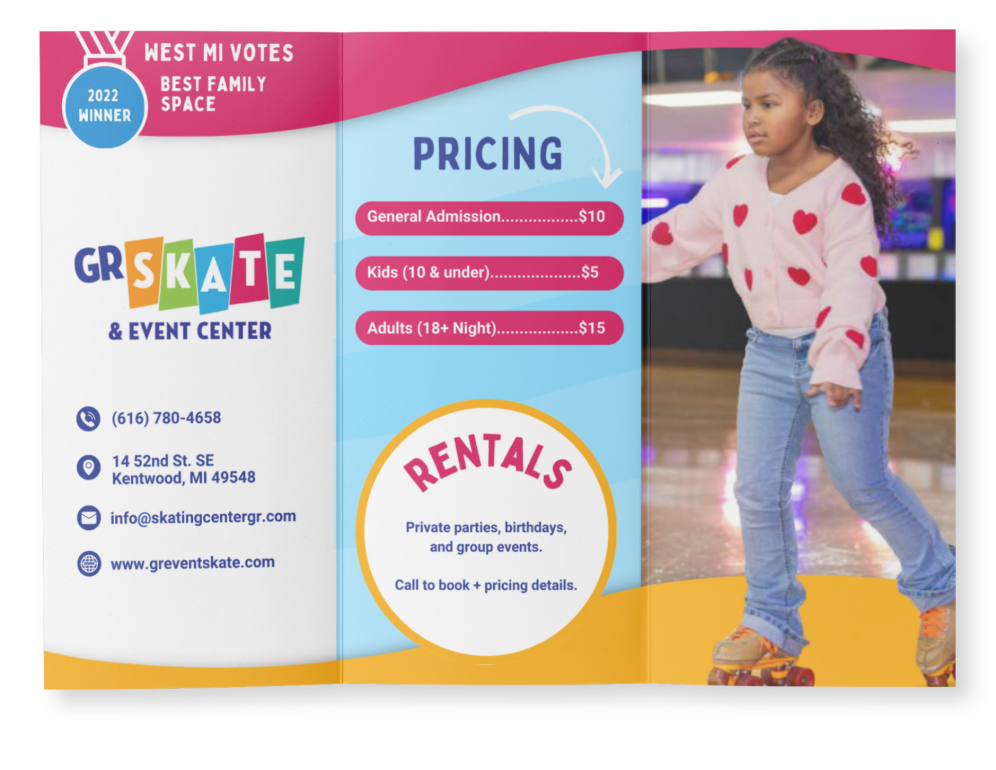
GR Event and Skate Center
Print materials designed to capture the energy of the rink through bold color, playful shapes, and expressive layouts. Every piece is meant to feel fun, inviting, and as lively as the experience itself.